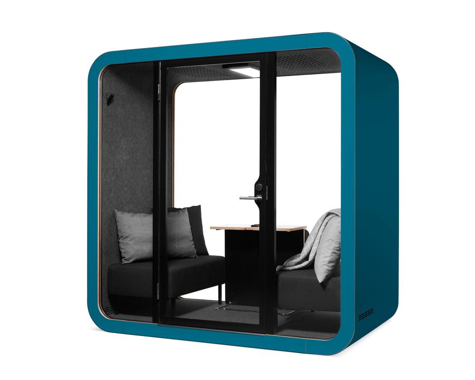
Bright office colors, as showcased in this Framery Petrol Blue sound-proof pod designed for open … [+]
Have you ever worked in an office that just didn’t seem to feel right? Ever had the sense your office clashed with your personality? Ever felt unproductive in any of the offices you occupied? The culprit could have been the office colors. That’s the word from an expert who provides employers with multi-hued work environments.
Studies have shown colors don’t just change our moods. They can actually impact productivity levels as well, says Lasse Karvinen, head of product at Framery, a Finnish company designing and manufacturing silent work “pods” for noisy open-space offices. “This is why employers have become more mindful, not just of workplace design as a whole, but specifically ways in which spaces are outfitted to support employee efficiency as well as happiness,” he adds.
“This includes a special consideration of color.”
Relaxing blues
Human brains are wired to experience light as an indicator of time of day, and as such a kind of barometer for how focused or laid back we should be, said Ben Hemley, future of work lead at JLL Pacific, where color and lighting design are essential tools in creating future workplaces. For that reason, colors impact whether we as employees sluff off or bust our butts to get the necessary workday tasks completed, he reports.
“People tend to believe red and orange are more stimulating colors, provoking strong emotional states, while they believe blues and greens to be more relaxing,” he says.
“However, what is really interesting is that while blue might be perceived as a more relaxing color, blue light — specifically around the 17,000k color temperature – is actually better at making people feel more energized, or at least less sleepy . . . This is because it suppresses the body’s natural production of melatonin, a hormone that helps to regulate our circadian rhythm, the pattern that determines when we naturally sleep and wake. You may have noticed newer phone updates will give you the option to ‘shift’ the color of the LEDs in the screen to be more reddish at night so you won’t be kept awake at night by your TikTok feed.”
Green ascendant
At the time of Framery’s founding, corporate customers frequently, even routinely, opted to order black or white pods. That made sense, given corporate offices remained fairly traditional in the early 2000s. More recently, approaches to the workplace have shifted. Employers have chosen to make offices less staid and more fun. They are now more inviting places that are in some instances specifically aligned with branding. The change has come, Karvinen adds, “With the intention, of course, to attract and retain top talent as well as generate a positive company culture.”
While neutral colors like beige and light grey are expected to continue playing key roles in modern workplaces, the color green has surged in popularity in the last year, says Karvinen. That finding is based on ballooning orders from Framery’s corporate clients for emerald pods. “To my knowledge, green is said to create a level of alertness and is often incorporated into health care spaces for this reason,” he adds. “So it’s interesting to see that being tied into today’s workplace. I also feel many are turning to green as it continues to gain strength from its association with a shift toward eco-consciousness.”
Changing rooms
Successful office designs derive from collaborative undertakings between employers, designers and product manufacturers, Karvinen says. Color is critical to success.
It begins with a design intention for the space, which then percolates down to the designers’ plans and product specifications. “We are sometimes surprised by these outcomes,” he adds. “For example, when corporate, buttoned-up companies receive ‘piglet pink’ or ‘lemon yellow’ pods, it [indicates] progressive employers lending themselves to a modern office shakeup that noticeably benefits company morale.”
One such progressive employer is Colliers in Frankfurt, Germany. The company moved from light grey and white to a more multi-hued palette last year, when it added Framery pods in primary colors red, blue and yellow. “People are afraid of colors sometimes, but it can completely change a room and instantly make a space feel more inviting,” says Nina Breuer, Colliers associate director. “We found that it feels better to be surrounded by colors . . . Our office [is] a perfect example of a successful productive environment.”
